Progressive disclosure and memory load
What to do and why
Separate information by its role in the task, not by whether it makes the page look busy:
| Role | Starting placement | Change the recommendation when… |
|---|---|---|
| Factors needed together for comparison | Visible with alternatives and action context | The task becomes sequential and earlier factors no longer affect later choices |
| How a value was constructed | Labeled explanation or expansion beside the value | Method, freshness, or uncertainty routinely changes the decision; expose that part up front |
| Evidence for investigating an exception | In-place diagnostics or linked investigation | Exceptions are frequent, high consequence, or require comparison across many items |
This placement table is Viewrule's task-dependent synthesis of disclosure and recognition/recall. Hiding infrequent controls can reduce distraction; hiding comparison operands creates a memory task. Neither “always show less” nor “always show everything” follows.
Prefer, avoid, and exceptions
Prefer disclosure for long derivations and infrequent supporting work. Avoid separate tabs for operands of a routine comparison. Scrolling a long expansion can also remove context: retaining an item's header in the DOM is not the same as keeping it visible.
A detail page is appropriate for extended editing, a shareable investigation, or a multi-step audit. Carry the item identity and relevant summary forward; preserve filters and scroll position on return. If several expanded trends must be compared, use small multiples or a comparison workspace instead of an accordion that closes its neighbors.
Examples
Good: proposal A expanded reveals a labeled seven-day trend, its actual values, and diagnostic notes beneath unchanged routine factors. The uncertainty range remains in the collapsed row because the exercise assumes it matters before acting.
Bad for comparing proposals: detail replaces the list. The underlying data is unchanged, but users cannot compare A and B without returning and opening another proposal. This may be good for a different task: editing A's complete contract alone.
Change the task, keep the data
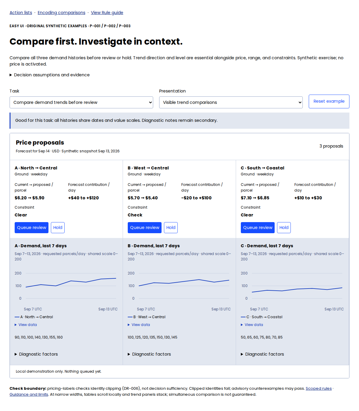
Use the task and presentation selectors to compare visible demand histories with collapsed histories. For the trend task, history is essential alongside the price, range, and constraint. Shared dates and 0–200 scales put the histories together at desktop width; model notes remain expandable. On mobile the panels stack, so simultaneous comparison is lost and needs task-specific review.
Now switch back to the routine task with compact rows: history is supporting evidence again. The data is identical; the information needed to act has changed. This is an explicit synthetic assumption, not evidence that operators never need trends.
Rendered trend comparison: 1200 CSS px wide, device scale 1.
A second good variant puts a short formula explanation in a disclosure while keeping its result, units, and material assumptions visible. A bad variant hides the units and period under “More”; identical numbers can then be mistaken for comparable quantities. These examples are design hypotheses, not measured cognitive-load results.
Evidence and limits
E-DISCLOSURE and E-RECALL are practitioner guidance. E-DISCLOSURE-APG is W3C's informative implementation pattern, not experimental proof of reduced memory load. No universal memory-slot count or allowable number of tabs is asserted.
Automated checks and judgment
Use no-clip, context, and declared visibility requirements under DR-003/DR-006. Check keyboard operation, focus, accessible names, and expanded state following the disclosure pattern. The example uses a real button with aria-expanded and aria-controls. Automated geometry cannot decide whether an explanation is essential or whether users remember hidden values accurately. Inspect the expanded state and observe the complete task, including return navigation.